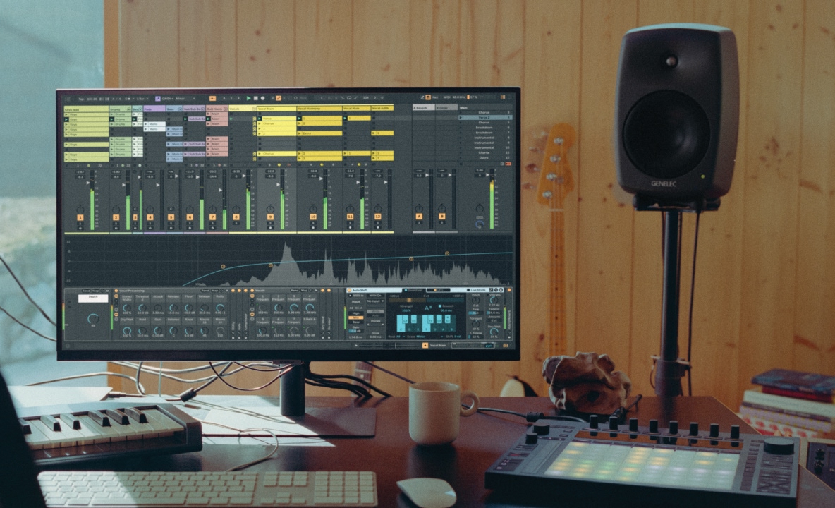
• About
  • UTC +1

    Persuasion Between Two Skips

    This animation is an exercise in the abstract expression of my immediate urban environment. How might the familiar landscape of Berlin be used to communicate my evolving relationship with it? Which characteristics of the city best reflect how I perceive it? This experiment uses the deformation of 3D photogrammetry models to produce an uncanny portrait of reality.

    Audio by Viewfinder aka Anna Tskhovrebov.

    Animation, 2024

    Untitled Walking Simulator

    There's something of an incliniation to absolutely surrender myself to the all-encompasing and inescapable black hole of the city. Not because I particularly desire to, but because I feel I must resign myself to the inevitable and the absurd. Still, we exist — but in what remains? Here is an exploration of that experience; a sort of gulf — a deep ravine, chasm, or abyss.

    This is an ongoing interactive "game" project. An urban environment is portrayed with rudimentary 3D graphics, allowing the player to explore an implicit, ambient narrative.

    In Progress

    A screenshot from a 3D game rendered in a white wireframe style with a black background. The scene portrays of a pile of trash. A screenshot from a 3D game rendered in a white wireframe style with a black background. The scene portrays a city street lined with vehicles. A screenshot from a 3D game rendered in a white wireframe style with a black background. The scene portrays a far-away view of a city street with crosswalk.

    Freeze Etch — All Context Vanishes

    Adam Duckworth is my cousin and a skilled musician. Throughout our adolescent and adult lives, we've enjoyed a fruitful creative relationship encompassing visual art and music.

    In 2020, 12 years after his first full-length album, Vessels, he released All Context Vanishes. There followed two collections of remixes — All Context Remixed and All Context Remixed V2.

    For this artwork I rode my bicycle around the city of Berlin searching for locations that might prove appropriate photogrammetry subjects. Adam however was unsatisfied with the outcome, so we chose a more personal subject: photos of a formative house he had lived in from 2008-2011. The results proved substantive, though they took some practice. The first turned out okay, the second was better, and the third was the best. They're displayed in reverse chronological order.

    Graphic Design, 2019–2021

    Digital artwork containing greyscale abstract three-dimesional forms against a solid blue background. Digital artwork containing greyscale abstract three-dimesional forms against a solid green background. Digital artwork containing greyscale abstract three-dimesional forms against a solid black background.

    Ableton Live — Instruments and Effects

    Since 2016 I've been working as an interface designer at Ableton. My formal role focuses on the design of musical instruments and audio effects, as well as on providing design guidance and resources for my department.

    I believe Ableton's mission and values can be a positive influence on our modern lives, and I am truly grateful to be able to contribute to them. Over the years the people I've had the privilege to collaborate with, the challenges, the conflicts, the opportunities, and the learnings both personal and professional have made it a continually rewarding experience.

    Here you can find a list of devices for Ableton Live that I've contributed to:

    Core Library

    In collaboration with Christian Kleine, Matt Jackson, Marco Tonni, and Harry Bissett.

    Channel EQ
    Delay
    DS Clang
    DS Clap
    DS Cymbal
    DS FM
    DS HH
    DS Kick
    DS Sampler
    DS Snare
    DS Tom
    Envelope Follower
    Envelope MIDI
    Expression Control
    Hybrid Reverb
    LFO
    MIDI Monitor
    MPE Control
    Note Echo
    Pedal
    Phaser-Flanger
    Redux
    Shaper
    Utility

    Convolution Reverb

    In collaboration with Matt Jackson, and Christian Kleine.

    Convolution Reverb
    Convolution Reverb Pro
    IR Measurement Device

    PitchLoop89

    In collaboration with Robert Henke.

    Creative Extensions

    In collaboration with Christian Kleine, Marco Tonni, and Maurizio Giri.

    Color Limiter
    Gated Delay
    Melodic Steps
    Pitch Hack
    Re-Enveloper
    Spectral Blur

    CV Tools

    In collaboration with Matt Jackson and Skinnerbox.

    CV Clock In
    CV Clock Out
    CV Envelope Follower
    CV Instrument
    CV In
    CV LFO
    CV Shaper
    CV Triggers
    CV Utility
    Rotating Rhythm Generator

    Microtuner

    In collaboration with Matt Jackson and Iftah Gabbai.

    Inspired by Nature

    In collaboration with Dillon Bastan and Trang Nguyen.

    Bouncy Notes
    Vector Delay
    Vector FM
    Vector Grain

    Interface Design, 2016–Current

    Collection of user interface designs for music production software arranged into a grid agaist a blue background.

    Survey

    One theme that I'm drawn to is closure, in the gestalt psychology sense — our tendency to automatically fill in the gaps when given an incomplete picture. This piece is an exercise in closure. I believe it's not so much what we perceive directly that leaves an impression on us, but what we perceive indirectly. The empty spaces of implied environments activate the imagination and allow us to participate in them. This subconscious participation can make these symbols more engaging and more "real" than when we are given all the information.

    Animation, 2021

    A Scent, a State for Each Chapter

    In 2017 I released a short EP of experimental ambient music. While I do not consider myself a very skilled musician I do find great satisfaction in exploring the design of sound and mood, particularly those with meditative and focused qualities. Much of the album relies on samples of short, expressive musical phrases that have been stretched and looped.

    Thematically the music is inspired by memory. I find that when recalling previous periods of my life I associate a distinct character with them. This character is generally compartmentalized and exists as discreet chapters. As I get older the chapters become stale.

    The unexpectedly expressive photo of a house cat appearing to experience an existential crisis is an old family photo from my mother.

    It's possible to listen to the music on Bandcamp.

    Old color photograph of a house cat with an anxious facial expression sitting in a home stairway.

    To accompany the music there exists a website at eric-carl.com, which was created with the assistance of Theo Lampert. Each song is paired with an edited sample of found footage. It could be said that it's interesting how the footage gets recontextualized and takes on a different character than its source. You could also just say that it was stolen. I guess it depends on how you look at it.

    Screenshot from a website featuring the face of a young boy in black and white. Screenshot from a website featuring microscopic film footage of crystals forming in black and white. Screenshot from a website featuring a dancer with their arms outstretched in black and white. Screenshot from a website featuring the profile of a person's face in black and white.

    I had the opportunity to perform the music twice in Berlin in 2017; first at the Berghain Kantine as part of the Traurig und Untanzbar event organized by Tobias Lichtmann, and second at the Spektrum venue, which is sadly no longer in existence, as part of an event series organized by Dirk Markham.

    Music, 2017

    Photograph of the author performing music behind two laptop computers with old home video footage projected in the background.

    GIFs

    The animated gif — a dear format of the internet, longstanding, humble, and dependable.* Over the last few years I've enjoyed it as a subject for visual explorations of looping rudimentary elements, space, and noise.

    How can the visual subject justify the format of the loop? What is the value of seamlessness and seams? One doesn't have to be too skilled at creating the illusion of life when noise will do so much for you. They're primarily black and white as I find the structural and spatial qualities of form compelling to explore (plus it looks dramatic).

    *Let's acknowledge that what you see here are videos rather than gifs. This is due to the fact that videos are more economical in regard to file size, performance, and energy consumption. Let's hope that these characteristics don't contribute to the format's demise.

    Animation, 2015–Current

    Black and white 3D animation from a first person perspective, traveling down a tunnel in the style of vintage computer graphics.

    Kin — Modular MIDI Controller Concept

    One thing we can do is come up with ideas. Here's one for a modular MIDI controller system, for the purposes of making music. The system consists of a series of control surfaces that can be combined according to the personal needs of the musician. These are mockups for speculative visualisation only.

    It's thought-provoking to invest oneself in an idea then look upon it later with an alternate perspective. How do our feelings change? Here my concern shifted to one of cost/benefit. What is the cost of producing even more physical products and foisting them upon the world? Adding to the world has a cost, not only of natural resources, but also of the space and attention consumed by something's existence. There is just so much. What criteria is needed to justify more? Would such criteria even be desirable?

    Product Design, 2015

    3D render of an arrangement of MIDI hardware controllers with soft, dramatic lighting. 3D render of a black, modular MIDI controller containing various sized dials. 3D render of a black, modular MIDI controller containing a variety of control types. 3D render of a minimalist, black MIDI keyboard controller. 3D render of a MIDI controller module containing a single joystick. 3D render of a MIDI controller module containing four sliders. 3D render of a MIDI controller module containing a grid of 16 rubber drum pads. 3D render of a MIDI controller module containing a grid of 16 plastic arcade-style buttons.

    Tangible Interaction — Digital Graffiti Wall

    I had the opportunity to work with Tangible Interaction on the interface design of their Digital Graffiti Wall. The Digital Graffiti Wall allows individuals to perform various digital graffiti-related tasks such as spray painting, mixing colors, and choosing nozzle types, brushes, or stickers. The most challenging thing about this project was designing for a full-body experience without a live prototype for scale. So, I just put some tape on the wall.

    The people at Tangible Interaction were very pleasant to work with, and I hope they are doing well. We can thank them for the nice video you see here.

    Interface Design, 2014

    Microfilm

    This artwork was designed to accompany a short and unfortunately abandoned collection of electronic music. I found it enjoyable to explore the juxtaposition of a rich (in both substance and style) found photograph and rigid synthesizer graphics. Both elements are randomly interrupted and distorted for the purposes of ambiguity.

    The back turned out better than the front as I find the front too "on the nose" (that is to say, lacking nuance). Can you guess which is which?

    Graphic Design, 2013

    Abstract digital collage consististing of a technical diagram on top of a distorted photograph of a child crying in the street. Abstract digital collage consististing of a technical diagram on top of a severely distorted photograph.

    Logos

    While not a core areas of focus, I do sometimes enjoy the task of designing a logo. Here you can see a small selection, both commissioned and self-initiated. The challenge is notable: create a symbol that honestly represents the subject, reduce the form to its most fundamental, and imbue it with an undefinable character that makes it relatable, timeless, unique, and memorable. Good luck!

    Graphic Design, 2006–Current

    Remote Computer Value Definer

    Here we have a speculative design exploration for an iPad app that acts as a remote control for Ableton Live. The app is intended as a tangential input source while working with Live in a focused desktop environment. The context of use is assumed to be something akin to sound-design-as-songwriting, affording a meditative and mindful experience that focuses on only one or two parameters at a time.

    At some point I read a definition of minimalism that described it not so much as reduction of the superfluous, but as focusing on a singular characteristic. This is intended to be in that vein.

    Interface Design, 2013

    The Venusian

    This illustration was commissioned by a friend for their feminist science fiction anthology, The Venusian. The illustration explores two-dimensional form and contrast through the subject of a space suit helmet. Is it human or alien?

    I'm unsure if the anthology was ever completed, but sometimes the end result isn't the most important thing. The idea itself and the experience of pursuing it can be just as valuable.

    Illustration, 2012

    Two-dimensional, geometric illustration of a black alien spaceship helmet with many detailed interior lines on a white background.

    little-scale — Destroy Yourself Already!

    little-scale of Australia makes enjoyable music that, while most easily defined as "chiptune", is broader in practice. It's abstract, experimental, evocative, and impressionistic. I made this artwork for fun, then I made it again. Maybe you'd like to listen to the music?

    Graphic Design, 2011

    Abstract digital collage with technically styled pink lines and letters on top of a glitchy, distorted photograph of a forest.

    Instruction — Gnomon School of Visual Effects

    From 2010 to 2015 I taught a 10-week Graphic Design course at Gnomon School of Visual Effects in Hollywood, CA. This course occurred during a 3-year program in which students developed artistic skills for the entertainment industry including 3D modeling, visual effects, matte painting, and concept design.

    I had the opportunity to develop a curriculum intended to bridge the gap between traditional graphic design and the more illustrative and 3D disciplines of film and video games. As a course that students encountered early in the program there was a focus on fundamental design principles and how they might be applied to various artistic fields.

    I was an untested instructor, and teaching was a strong catalyst for my own personal growth. I developed a stronger intellectual curiosity for design and became more confident as a speaker. Having a new group of students four times a year meant a regular rotation of new perspectives that often challenged my own assumptions.

    Teaching, 2010–2015

    Photograph of the side of a beige building with a sign reading 'Gnomon'.

    Diesel: Only the Brave

    In 2009 I was invited by HKI with several other artists to contribute a design for a browser-based 3D room to support the marketing of Diesel's Only the Brave fragrance. That's right, I traded my creative labor to help sell cosmetics. We must all engage in capitalism from time to time.

    What's unfortunate is that this project relied on the now extinct Adobe Flash plugin, so sharing the work is difficult. In its place is this static 2D version that approximates the original. You may need to use your imagination to visualize the addition of multi-colored neon lines raining from the sky with an accompanying electronic soundtrack that builds to a climactic digital hysteria.

    Illustration, 2009

    Digital collage and illustration of a man's head floating in outer space with a painful facial expression and eyes wide open.

    White Shrine

    If you understand what's going on here, you'll have to let me know. Sometimes a fun way to design can be to do things for reasons that are unclear or irrational. In this case we're talking about a poster, or perhaps an illustration, or maybe even a digital photo collage. Regardless, we're just talking about making things — exploring what's possible and discovering why it's intriguing. A bit of ambiguity allows the viewer to draw their own conclusions.

    Following this piece, I was invited to contribute a tutorial to the now-extinct Computer Arts magazine, though I was disappointed with how the second attempt turned out. I felt that since I was unable to repeat the succes, I must be a hack, a fraud. Fortunately, now I believe that a mix of successes and failures are to be expected from the creative practice of nearly any artist. That comes with the territory. And who wants to repeat success by always doing the same thing?

    Graphic Design, 2008

    Black and white digital collage consisting of miscellaneous and occult objects forming an abstract skull shape in a symmetrical composition above text that reads 'Guess who's building nuclear power plants?'

    Teethmarks on the Barrel — A Warm Touch

    Sometimes an image absolutely arrests you, like this blind contour drawing of myself done by Natalie Rowe. It seems to give the impression of eating one's face. For years I've been hoping for a project to come along that might justify its use. For now, we'll just have to pretend that the band Teethmarks on the Barrel exists, and that they've released an album called A Warm Touch. I was in a band with this name many years ago, and band member Rob Monroe wrote a short story called "A Warm Touch". Natalie and Rob have both given us a lot.

    Graphic Design, Then and Now

    Music album cover featuring an abstract and sloppy line art drawing of a man's face viewed from the side on a white background.

    Blog.Sans-Concept.com

    From 2006 to 2012 I had a small blog where I would write about art and design. I would primarily share interesting work by other artists, inspirational resources, and whatever bit of random design ephemera I had recently taken a liking to (mainly illustration and science fiction from the 1970's).

    Like many others at the time, I eventually lost interest in the blog as centralized social media platforms became more dominant. Thankfully now the pendulum seems to be swinging back to smaller, self-owned communities.

    Since I would sometimes share work that was potentially long-forgotten, there were some occasions where an artist, or one of their family members, discovered the blog and reached out surprised to have found someone still sharing their work. These unexpected connections are one thing that I'm grateful the blog was able to achieve.

    Website Design, 2006–2012

    Screenshot of a website with a black background and colorful, illustrative title, displaying a blog post with photographs of posters.

    freezeetch.com 2007

    This was a website designed to support the musical endeavors of my cousin Adam Duckwork aka Freeze Etch. It was something of a throwaway project in the sense that Adam didn't ask for a new website, and I knew I didn't have the technical skills to complete it. But this seems to be how many projects are born. Will they grow into something substantial or be discarded?

    The design still resonates with me for some reason. I appreciate the contrast between the rigid, grid-based typography and the warm, abstract background imagery and color. It's composed of manipulated stock photographs of flowers.

    Website Design, 2007

    Screenshot of a website with a large, abstract green and orange background, with minimal, geometrically arranged paragraphs of text.

    sans-concept.com 2007

    This isn't a website that was ever published, but it's at least one that was designed. Is it dishonest to present it now in a way that doesn't quite reflect how it was then? Regardless, it's an old portfolio website much like this current one. I have a better idea of what I'm doing now than I did back then. That means progress, growth even. But isn't there value in naivety? What about the "beginner's mind"? What's the value of experience when context is so frequently changing?

    Website Design, 2007

    Screenshot of a website displaying a digital collage with a 70s era photograph of a man yelling at a woman and abstract drawings and bright colors on his face.

    I Used to Wear False Teeth

    I'm not sure where to start. Let's pretend that I released a small collection of music in 2006 and needed an album cover. My friend Leah Schroeder shot some portraits of me with some decorative objects. "I used to wear false teeth". Of course, if you're young false teeth are something you'll more likely wear in the future than in the past. It's a contradiction, but also personal.

    The back is a found photograph from a vintage French magazine. It seems strange to use a modern photo for the front and a found photo from the past for the back. But sometimes it's best not to overthink things.

    Graphic Design, 2006

    A black and white photograph with a three quarter view of a young man's face wearing gometric paper shapes covering his eyes and mouth. The back of a music album cover, including a found photograph of a person serving breakfast to a child with the album's tracklist overlaid in the top left corner.

    Eyesore

    This illustration was created for the now-defunct t-shirt Brand Oddica. Why exactly I thought this was something people might want to display on their body I'm not sure (it was 17 years ago). Regardless, this illustration consists of parts of my face.

    The people at Oddica were extremely nice and very generous to the artists with whom they collaborated. Once these shirts were printed, my friends and I wore them out bowling. That's a nice memory. It was later included in the book Torso.

    Apparel, 2006

    Abstract illustration of a large eye, several frowning mouths, and speech bubbles, with red line art on a white background.

    Amtrea T-Shirts

    Around the mid-2000s I went into business with Stuart Conover. Together we produced a line of graphic t-shirts, themed after the Midwest region of the United States of America (our home). Farm animals, sprinkler systems, Paul Bunyan, woodland debris, and electric pylon landscapes...these were our subjects. We launched the website, sold a handful of t-shirts, then immediately lost interest. I still wonder what happened to all those shirts.

    Looking back what I appreciate most are the skillful photographs of Leah Schroeder, featuring local friends Leslie and CJ. What can be said about Leslie, CJ, and Leah that isn't evident in their work? Only that I'm deeply appreciative of their contribution and the long-standing record of our collaboration.

    Apparel, 2005

    Photograph of a man modeling a brown t-shirt with an abstrtact line art drawing of a deer skull and branches. Photograph of a woman modeling a white t-shirt with an abstrtact illustration of a river and Paul Bunyan. Photograph of a woman modeling a green t-shirt with a yellow geometric illustration of a sprinkler head for lawns. Photograph of a man modeling a red t-shirt with a gold illustration of a rooster and laurels. Photograph of a man modeling a beige t-shirt with a light blue geometric illustration depicting hills and electricity pylons. Photograph of a man and woman looking at each other lovingly while standing next to a tree and modeling graphic t-shirts in front of a corn field. Photograph of a man and woman modeling graphic t-shirts while standing in front of a passing train moving at high speed.

    Freeze Etch — Rustic Tonnage

    This is an album cover had I made for my cousin Adam Duckwork aka Freeze Etch. As best as I can remember it was unsolicited and never used — a vessel without content. It was one of my first experiments with 3D graphics. You might be able to recognize some influence from other work that was popular at the time.

    I never really thought much of it until now, as this is the first time I chose to include it in a portfolio. It's a strange feeling, looking back at something you made so long ago and seeing something in it that you didn't appreciate at the time. Is that because our taste has changed or because we've forgotten the experience of making it?

    Graphic Design, 2003

    Musical album art containing abstract 3D shapes with an exaggerated perspective displayed on a white background. Musical album art containing abstract 3D shapes with an exaggerated perspective displayed on a white background.

    Winamp Skins

    Stop for a moment and imagine yourself back in the year 2000 or so. You can download some MP3s from Napster, but you'll need a computer program to listen to them. So, you might download Winamp. Then you might discover that you can customize the appearance of Winamp using skins. There is an absolute surplus available, created by a variety of passionate and creative people. Here are three that I've made. Once you're all settled you can play some Snood.

    Please note that two of these images are marred by moderate JPEG compression. That's unfortunate, but it's all that remains of these vintage computer graphics.

    Interface Design, 2001–2003

    A screenshot of the Winamp audio player with a minimal white visual appearance. A screenshot of the Winamp audio player with a minimal white visual appearance. A screenshot of the Winamp audio player with a futuristic blue, grey, and green appearance.

    Desktop Wallpapers

    During the late 90s and early 2000s it was common to seek out pleasing images for display on one's computer desktop. The format was a significant creative outlet for many digital designers around the time, myself included. The ones you see here reflect a time when I was beginning to solidify my skills as a digital artist. Thanks to my 20-year-old DeviantArt account I still have a record of them.

    Around this time, I was also a member of a digital art group called seire. I mention it only in the hopes that if someone were to search for it, they might stumble across this reference. This is my humble attempt to contribute some commemoration of its existence.

    Graphic Design, 2000–2001

    Digital artwork with a central, abstract, monochromatic blue collage containing 3D shapes and indiscernible, manipulated photographs on a white background. Digital artwork with detailed and aggressive geometric shapes in green and grey encroaching from the right side against a white background. Digital artwork with detailed, futuristic, geometric shapes in blue and grey composed on the right side against a white background. Digital artwork with an abstract composition of geometric shapes and manipulated photographs composed on the right side against a white and beige background. Digital artwork with abstract, angular, manipulated photographs in monochromatic blue composed on the right side against a white background. Digital art with an illustration of abstract, futuristic metal machinery in an asymmetrical composition focused on the right side.

    Primate

    Someone walked into the woods and took off their clothes. They documented the experience by taking some photographs with a disposable camera, which I later modified on the computer. They used the fundamental elements of nature to censor themselves.

    Graphic Design, 2000

    Digital artwork showing dark, abstract photographs of a man's body, stacked in a vertical composition.

    Turpentine V5

    Can a website also be a coming-of-age story? I'm not sure if this qualifies, but maybe it's something like that. Turpentine was my earliest design portfolio. In addition to artwork, it included some design tutorials and personal essays.

    What seems notable is the context in which it lived. During this time the personal portfolio website was a satellite of sorts — a member of a loose community of artists and designers, often orbiting a central message board (or two). Such a website held a precarious role, operating as both an individual creative outlet and community entrance point.

    You'll likely notice some curious blue question marks here. I'm thankful that archive.org still had some record of this website, even if it's missing a few pieces.

    Website Design, 2000

    Screenshot from a website displaying abstract, monochromatic green photographs of dismantled CRT televisions on a white background.

    User Maps — Duke Nukem 3D

    I like to attribute my professional career to a particular juvenile video game released in 1996, Duke Nukem 3D. I was a young teenager at the time and became absorbed into the modding community during the period when internet access was becoming widely available in the US.

    These early experiences of constructing environments in which one shoots aliens with guns began to develop my interest in game design and the evocative qualities of architecture. I also maintained a humble fan website called Asbestos' Duke 3D Page ("asbestos" was my map authoring name). This website is the earliest record I have of my design work and is an artifact of a particularly formative time.

    Eventually my interest in the game decreased while my interest in website design and digital art increased, which eventually lead to my education and career.

    In 2022, while working on the version of my portfolio that you're viewing now, I decided I would revisit some of my unfinished Duke Nukem 3D work and get it into a releasable state. The result of that is Bacon Grease, a level that was started in 1999, was completed in 2022, and is now available to play for those inclined to do so.

    Games, 1998–2022

    Screenshot of a first person shooter video game displaying a destroyed parking lot in a city. Screenshot of a first person shooter video game displaying a fountain surrounded by concrete stairs in an outdoor shopping center. Screenshot of a first person shooter video game displaying urban buildings and an entrance to a parking lot full of military storage crates. Two-dimensional map displaying the layout of a video game level design.

    Bacon Grease (Started in 1999, remastered and completed in 2022) — Download

    Screenshot of a first person shooter video game displaying military watchtowers in an outdoor arctic environment.

    Snow (1999) — Download

    Screenshot of a first person shooter video game displaying an outdoor urban environment including the entrance to a police station and a convenience store.

    Police (1998) — Download

    Screenshot of a first person shooter video game displaying the outside of a space station on the moon and a docked space ship.

    Polaris Outpost 2 (1998) — Download

    Screenshot of a first person shooter video game displaying the interior of a brick building and a dramatically lit entryway.

    Asbestos' Dukematch Collection (1998) — Download

    Screenshot of a website with a left-hand navigation, list of news updates on the right, topped with a science fiction style logo.

    Asbestos' Duke 3D Page on Geocities (1999)